Label encoding
When we perform classification, we usually deal with a lot of labels. These labels can be in the form of words, numbers, or something else. The machine learning functions in sklearn expect them to be numbers. So if they are already numbers, then we can use them directly to start training. But this is not usually the case.
In the real world, labels are in the form of words, because words are human readable. We label our training data with words so that the mapping can be tracked. To convert word labels into numbers, we need to use a label encoder. Label encoding refers to the process of transforming the word labels into numerical form. This enables the algorithms to operate on our data.
Create a new Python file and import the following packages:
import numpy as np
from sklearn import preprocessing
Define some sample labels:
# Sample input labels
input_labels = ['red', 'black', 'red', 'green', 'black', 'yellow', 'white']
Create the label encoder object and train it:
# Create label encoder and fit the labels
encoder = preprocessing.LabelEncoder()
encoder.fit(input_labels)
Print the mapping between words and numbers:
# Print the mapping
print("\nLabel mapping:")
for i, item in enumerate(encoder.classes_):
    print(item, '-->;',i)
Let’s encode a set of randomly ordered labels to see how it performs:
# Encode a set of labels using the encoder
test_labels = ['green', 'red', 'black']
encoded_values = encoder.transform(test_labels)
print("\nLabels =", test_labels)
print("Encoded values =", list(encoded_values))
Let’s decode a random set of numbers:
# Decode a set of values using the encoder
encoded_values = [3, 0, 4, 1]
decoded_list = encoder.inverse_transform(encoded_values)
print("\nEncoded values =", encoded_values)
print("Decoded labels =", list(decoded_list))
If you run the code, you will see the following output:
You can check the mapping to see that the encoding and decoding steps are correct. The code for this section is given in the label_encoder.py file.
Logistic Regression classifier
Logistic regression is a technique that is used to explain the relationship between input variables and output variables. The input variables are assumed to be independent and the output variable is referred to as the dependent variable. The dependent variable can take only a fixed set of values. These values correspond to the classes of the classification problem.
Our goal is to identify the relationship between the independent variables and the dependent variables by estimating the probabilities using a logistic function. This logistic function is a sigmoid curve that’s used to build the function with various parameters. It is very closely related to generalized linear model analysis, where we try to fit a line to a bunch of points to minimize the error. Instead of using linear regression, we use logistic regression. Logistic regression by itself is actually not a classification technique, but we use it in this way so as to facilitate classification. It is used very commonly in machine learning because of its simplicity. Let’s see how to build a classifier using logistic regression. Make sure you have Tkinter package installed on your system before you proceed. If you don’t, you can find it at: https://docs.python.org/2/library/tkinter.html.
Create a new Python file and import the following packages. We will be importing a function from the file utilities.py. We will be looking into that function very soon. But for now, let’s import it:
import numpy as np
from sklearn import linear_model
import matplotlib.pyplot as plt

from utilities import visualize_classifier
Define sample input data with two-dimensional vectors and corresponding labels:
# Define sample input data
X = np.array([[3.1, 7.2], [4, 6.7], [2.9, 8], [5.1, 4.5], [6, 5], [5.6, 5],[3.3, 0.4], [3.9, 0.9], [2.8, 1], [0.5, 3.4], [1, 4], [0.6, 4.9]])
y = np.array([0, 0, 0, 1, 1, 1, 2, 2, 2, 3, 3, 3])
We will train the classifier using this labeled data. Now create the logistic regression classifier object:
# Create the logistic regression classifier
classifier = linear_model.LogisticRegression(solver='liblinear', C=1)
Train the classifier using the data that we defined earlier:
# Train the classifier
classifier.fit(X, y)
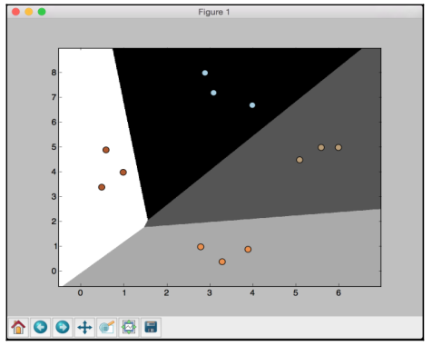
Visualize the performance of the classifier by looking at the boundaries of the classes:
# Visualize the performance of the classifier visualize_classifier(classifier, X, y)
We need to define this function before we can use it. We will be using this multiple times in this chapter, so it’s better to define it in a separate file and import the function. This function is given in the utilities.py file provided to you.
Create a new Python file and import the following packages:
import numpy as np
import matplotlib.pyplot as plt<br>
Create the function definition by taking the classifier object, input data, and labels as input parameters:
def visualize_classifier(classifier, X, y):
# Define the minimum and maximum values for X and Y
# that will be used in the mesh grid
min_x, max_x = X[:, 0].min() - 1.0, X[:, 0].max() + 1.0
min_y, max_y = X[:, 1].min() - 1.0, X[:, 1].max() + 1.0
We also defined the minimum and maximum values of X and Y directions that will be used in our mesh grid. This grid is basically a set of values that is used to evaluate the function, so that we can visualize the boundaries of the classes. Define the step size for the grid and create it using the minimum and maximum values:
# Define the step size to use in plotting the mesh grid
mesh_step_size = 0.01
# Define the mesh grid of X and Y values
x_vals, y_vals = np.meshgrid(np.arange(min_x, max_x, mesh_step_size), np.arange(min_y, max_y, mesh_step_size))
Run the classifier on all the points on the grid:
# Run the classifier on the mesh grid
output = classifier.predict(np.c_[x_vals.ravel(), y_vals.ravel()])

# Reshape the output array
output = output.reshape(x_vals.shape)
Create the figure, pick a color scheme, and overlay all the points:
# Create a plot
plt.figure()

# Choose a color scheme for the plot
plt.pcolormesh(x_vals, y_vals, output, cmap=plt.cm.gray)

# Overlay the training points on the plot
plt.scatter(X[:, 0], X[:, 1], c=y, s=75, edgecolors='black', linewidth=1, cmap=plt.cm.Paired)
Specify the boundaries of the plots using the minimum and maximum values, add the tick marks, and display the figure:
# Specify the boundaries of the plot
plt.xlim(x_vals.min(), x_vals.max())
plt.ylim(y_vals.min(), y_vals.max())

# Specify the ticks on the X and Y axes
plt.xticks((np.arange(int(X[:, 0].min() - 1), int(X[:, 0].max() + 1),1.0)))
plt.yticks((np.arange(int(X[:, 1].min() - 1), int(X[:, 1].max() + 1), 1.0)))

plt.show()
If you run the code, you will see the following screenshot:
If you change the value of C to 100 in the following line, you will see that the boundaries become more accurate:
classifier = linear_model.LogisticRegression(solver='liblinear', C=100)
The reason is that C imposes a certain penalty on misclassification, so the algorithm customizes more to the training data. You should be careful with this parameter, because if you increase it by a lot, it will overfit to the training data and it won’t generalize well.
If you run the code with C set to 100, you will see the following screenshot:
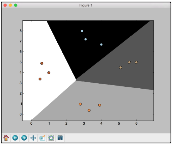
If you compare with the earlier figure, you will see that the boundaries are now better. The code for this section is given in the logistic_regression.py file.
Naïve Bayes classifier
Naïve Bayes is a technique used to build classifiers using Bayes theorem. Bayes theorem describes the probability of an event occurring based on different conditions that are related to this event. We build a Naïve Bayes classifier by assigning class labels to problem instances. These problem instances are represented as vectors of feature values. The assumption here is that the value of any given feature is independent of the value of any other feature. This is called the independence assumption, which is the naïve part of a Naïve Bayes classifier.
Given the class variable, we can just see how a given feature affects, it regardless of its affect on other features. For example, an animal may be considered a cheetah if it is spotted, has four legs, has a tail, and runs at about 70 MPH. A Naïve Bayes classifier considers that each of these features contributes independently to the outcome. The outcome refers to the probability that this animal is a cheetah. We don’t concern ourselves with the correlations that may exist between skin patterns, number of legs, presence of a tail, and movement speed. Let’s see how to build a Naïve Bayes classifier.
Create a new Python file and import the following packages:
import numpy as np
import matplotlib.pyplot as plt
from sklearn.Naïve_bayes import GaussianNB
from sklearn import cross_validation

from utilities import visualize_classifier
We will be using the file data_multivar_nb.txt as the source of data. This file contains comma separated values in each line:
# Input file containing data
input_file = 'data_multivar_nb.txt'
Let’s load the data from this file:
# Load data from input file
data = np.loadtxt(input_file, delimiter=',')
X, y = data[:, :-1], data[:, -1]
Create an instance of the Naïve Bayes classifier. We will be using the Gaussian Naïve Bayes classifier here. In this type of classifier, we assume that the values associated in each class follow a Gaussian distribution:
# Create Naïve Bayes classifier
classifier = GaussianNB()
Train the classifier using the training data:
# Train the classifier
classifier.fit(X, y)
Run the classifier on the training data and predict the output:
# Predict the values for training data
y_pred = classifier.predict(X)
Let’s compute the accuracy of the classifier by comparing the predicted values with the true labels, and then visualize the performance:
# Compute accuracy
accuracy = 100.0 * (y == y_pred).sum() / X.shape[0]
print("Accuracy of Naïve Bayes classifier =", round(accuracy, 2), "%")

# Visualize the performance of the classifier
visualize_classifier(classifier, X, y)
The preceding method to compute the accuracy of the classifier is not very robust. We need to perform cross validation, so that we don’t use the same training data when we are testing it.
Split the data into training and testing subsets. As specified by the test_size parameter in the line below, we will allocate 80% for training and the remaining 20% for testing. We’ll then train a Naïve Bayes classifier on this data:
# Split data into training and test data
X_train, X_test, y_train, y_test = cross_validation.train_test_split(X, y, test_size=0.2, random_state=3)
classifier_new = GaussianNB()
classifier_new.fit(X_train, y_train) y_test_pred = classifier_new.predict(X_test)
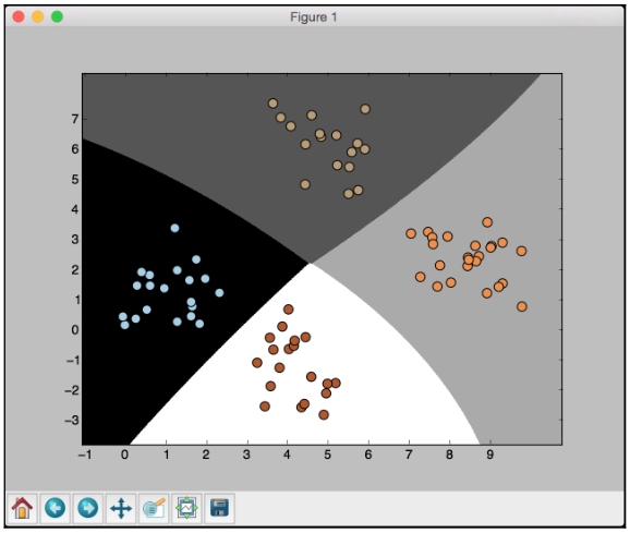
Compute the accuracy of the classifier and visualize the performance:
# compute accuracy of the classifier
accuracy = 100.0 * (y_test == y_test_pred).sum() / X_test.shape[0]
print("Accuracy of the new classifier =", round(accuracy, 2), "%")

# Visualize the performance of the classifier
visualize_classifier(classifier_new, X_test, y_test)
Let’s use the inbuilt functions to calculate the accuracy, precision, and recall values based on threefold cross validation:
num_folds = 3
accuracy_values = cross_validation.cross_val_score(classifier, X, y, scoring='accuracy', cv=num_folds)
print("Accuracy: " + str(round(100*accuracy_values.mean(), 2)) + "%")
precision_values = cross_validation.cross_val_score(classifier, X, y, scoring='precision_weighted', cv=num_folds)
print("Precision: " + str(round(100*precision_values.mean(), 2)) + "%")
recall_values = cross_validation.cross_val_score(classifier, X, y, scoring='recall_weighted', cv=num_folds)
print("Recall: " + str(round(100*recall_values.mean(), 2)) + "%")
f1_values = cross_validation.cross_val_score(classifier, X, y, scoring='f1_weighted', cv=num_folds)
print("F1: " + str(round(100*f1_values.mean(), 2)) + "%")
If you run the code, you will see this for the first training run:
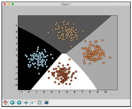
The preceding screenshot shows the boundaries obtained from the classifier. We can see that they separate the 4 clusters well and create regions with boundaries based on the distribution of the input datapoints. You will see in the following screenshot the second training run with cross validation:
You will see the following printed on your Terminal:
Accuracy of Naïve Bayes classifier = 99.75 %
Accuracy of the new classifier = 100.0 %
Accuracy: 99.75%
Precision: 99.76%
Recall: 99.75%
F1: 99.75%
The code for this section is given in the file naive_bayes.py.
Confusion matrix
A Confusion matrix is a figure or a table that is used to describe the performance of a classifier. It is usually extracted from a test dataset for which the ground truth is known. We compare each class with every other class and see how many samples are misclassified.
During the construction of this table, we actually come across several key metrics that are very important in the field of machine learning. Let’s consider a binary classification case where the output is either 0 or 1:
- True positives: These are the samples for which we predicted 1 as the output and the ground truth is 1 too.
- True negatives: These are the samples for which we predicted 0 as the output and the ground truth is 0 too.
- False positives: These are the samples for which we predicted 1 as the output but the ground truth is 0. This is also known as a Type I error.
- False negatives: These are the samples for which we predicted 0 as the output but the ground truth is 1. This is also known as a Type II error.
Depending on the problem at hand, we may have to optimize our algorithm to reduce the false positive or the false negative rate. For example, in a biometric identification system, it is very important to avoid false positives, because the wrong people might get access to sensitive information. Let’s see how to create a confusion matrix.
Create a new Python file and import the following packages:
import numpy as np
import matplotlib.pyplot as plt
from sklearn.metrics import confusion_matrix
from sklearn.metrics import classification_report<br>
Define some samples labels for the ground truth and the predicted output:
# Define sample labels
true_labels = [2, 0, 0, 2, 4, 4, 1, 0, 3, 3, 3]
pred_labels = [2, 1, 0, 2, 4, 3, 1, 0, 1, 3, 3]
Create the confusion matrix using the labels we just defined:
# Create confusion matrix
confusion_mat = confusion_matrix(true_labels, pred_labels)
Visualize the confusion matrix:
# Visualize confusion matrix
plt.imshow(confusion_mat, interpolation='nearest', cmap=plt.cm.gray)
plt.title('Confusion matrix')
plt.colorbar()
ticks = np.arange(5)
plt.xticks(ticks, ticks)
plt.yticks(ticks, ticks)
plt.ylabel('True labels')
plt.xlabel('Predicted labels')
plt.show()
In the above visualization code, the ticks variable refers to the number of distinct classes. In our case, we have five distinct labels.
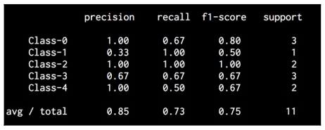
Let’s print the classification report:
# Classification report
targets = ['Class-0', 'Class-1', 'Class-2', 'Class-3', 'Class-4']
print('\n', classification_report(true_labels, pred_labels,
target_names=targets))
The classification report prints the performance for each class. If you run the code, you will see the following screenshot:
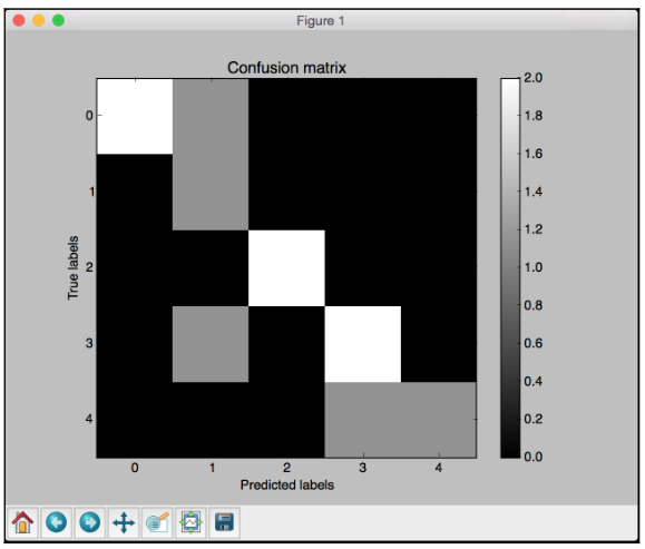
White indicates higher values, whereas black indicates lower values as seen on the color map slider. In an ideal scenario, the diagonal squares will be all white and everything else will be black. This indicates 100% accuracy.
You will see the following printed on your Terminal:
The code for this section is given in the file confusion_matrix.py.